The Garden Nook
There were a few tasks I wanted to accomplish for this brand:
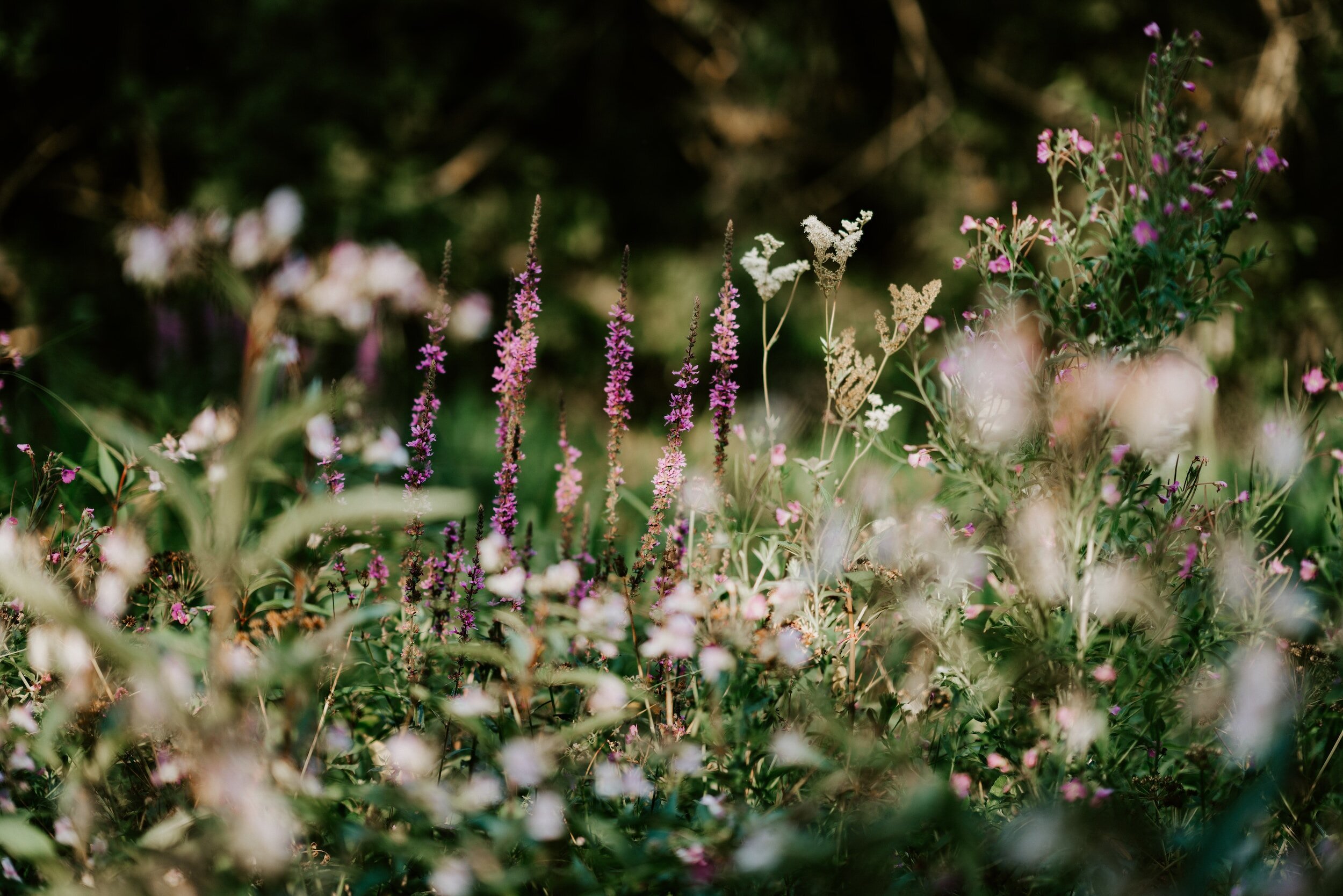
One was to incorporate purple into this design. I rarely use purple in my designs and wanted to try it out for this one. I'm enjoying the shades of purple I picked, which complement the light peach and pale green.
The second task was to play around with more typographic-based logo designs, which I decided would work best with the secondary logo I designed. The subtle leaf assists in the "visual sell" that this is a plant & floral store!


